

Blocks
Every block you can add to a KuikPage, what it does, and its main options.
Click Add block at the end of the outline, or the plus between two blocks on the canvas, to open the palette. Blocks are listed by name. Search, or filter by Basic, Media and Actions; click a block to add it. Blocks reorder by drag in the outline or on the canvas.
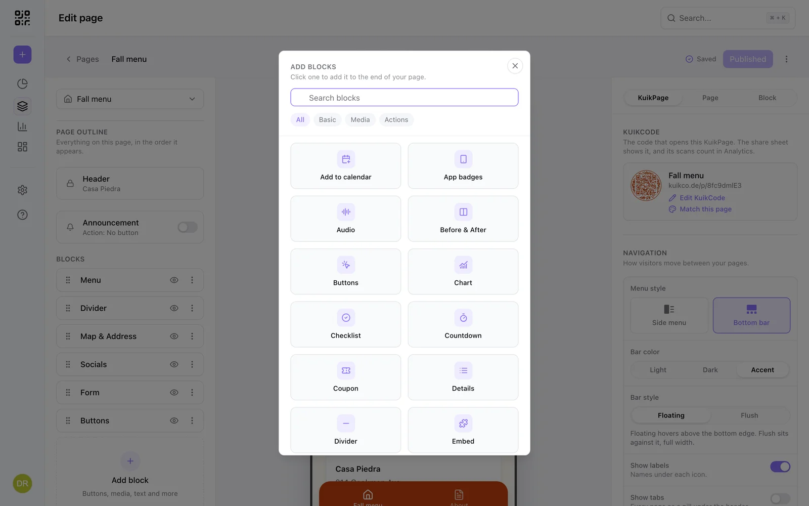
An image slot you have not filled yet shows placeholder art, a soft two-tone gradient, on the canvas and on the published page, so the page never has a hole where a photo goes; a new Gallery shows three such tiles and a new Products block starts with three products. The outline marks any block still showing starter content Needs content: a placeholder image, a link left empty or pointing at example.com, or a video, audio, file, embed or address not picked yet.
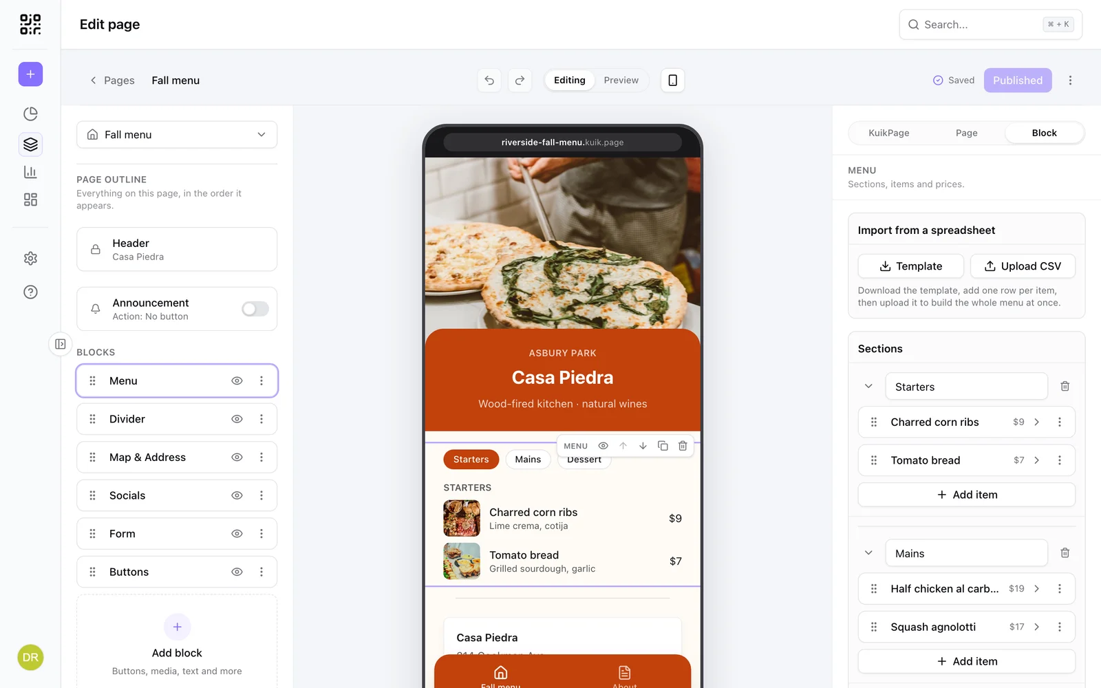
Select a block and the inspector switches to it. Every block has a Style set at the bottom of its panel for alignment, spacing and looks; the sets above it hold the content. Lists of items (buttons, menu items, products, questions) are cards you expand one at a time, reorder by drag, and duplicate or delete from their menu.
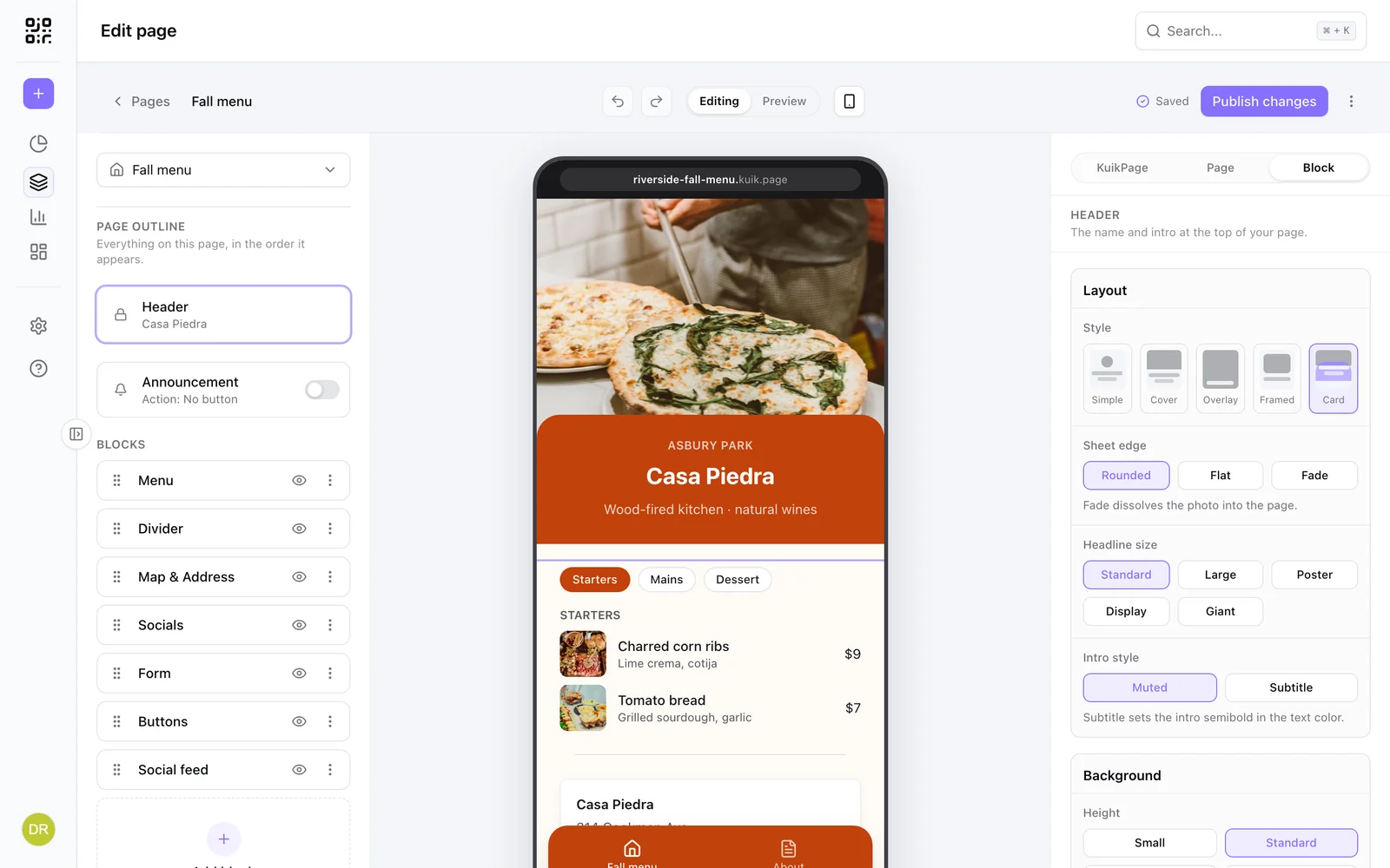
The Header is special: every page has exactly one, pinned to the top. It carries the title, intro, a logo or profile photo (the Circle shape turns any image into a portrait) and the page's opening visual, with layouts Simple, Cover, Overlay, Framed and Card, four heights (Small, Standard, Tall, Full), a fill (photo, color, gradient, split, animated shader or Waves, soft bands in a second color that drift slowly across the top and hold still for visitors who turn on reduced motion) and headline sizes up to Giant, which sets a short name as wide as the page allows. Its weight comes from Title weight in the KuikPage's Fonts, so every page's header matches. Texture lays one of 55 patterns over the background, whatever its fill (the same patterns as the QR frame's): pick one, or None, then its Color, Opacity, Size (relative to the header, so it repeats the same on a phone and on a computer) and Blend: Normal in its own color, Multiply for a deeper shade of the fill's own colors, Screen for a lighter one, Soft light or Overlay for more contrast. A first pattern on a colorful header starts on Multiply in one of its colors, on a photo or on black, white or grey on Normal. It stays inside the background, under a Cover or Card sheet, and on Overlay, where the words sit on the photo, it shows at 40% at most so they read. Headline color sets the title in the page's text color or its accent (the Card layout keeps white type on its accent sheet). Store badges put App Store and Google Play buttons in a row on the header (black or white, the official art): on Overlay at the foot of the photo, so they show on the first screen of a Full header, elsewhere under the words; a badge appears once its link is in. To set words of the title in italic, select them on the page or in the Headline field and press Cmd+I (Ctrl+I on Windows), or the Italic button that appears above the title while you type; a title font with a true italic, like Instrument Serif, draws them in it. Photo focus (Top, Middle, Bottom) picks the part of the photo that stays in view when the header crops it, so a group shot keeps its faces. Turn on Slideshow to pick up to four photos and the header crossfades through them on the published page, with small dots centered along the bottom of the photo marking the current one. Depth (Core and up) gives a single photo real depth: KuikCode reads a depth map from it once, and on the published page the photo shifts as the phone tilts or the cursor moves, near things travelling further than far ones, like photos on the latest iPhones. Strength sets how far; the still photo is what visitors see when motion is reduced, before the effect loads, or on a browser without WebGL. Swap the photo and the map is remade on its own; Regenerate depth forces a new one. On Overlay, Title behind the subject puts the person or product in the photo in front of the title: the photo is cut out once, with Quick remove for a plain background or AI remove for anything else, and the cutout is drawn over the title while the intro line and button stay on top; the photo stays solid, dissolving only at its bottom edge, so the subject is never see-through. It needs a single photo, and it turns Depth off (a moving photo would slip out from under the cutout). Swap the photo and the switch asks for a new cutout. The intro line under the title has an Intro style: Muted (the quiet grey default) or Subtitle (semibold, in the text color). On Cover and Card, Sheet edge decides how the photo meets the text below it: Rounded (the sheet's rounded top overlaps the photo; on a gradient or photo page background the sheet lets the page show through), Fade (the photo dissolves into the page behind it, a solid, gradient or photo background alike; on Card it dissolves into the accent sheet) or Flat (a straight seam). Corners decides what sits in the header's top corners, all in one Size (Small, Medium or Large) that the menu button follows too. The top right holds the menu on a KuikPage with more than one page, otherwise the Share button. It opens a sheet with the header's name and picture (or the corner logo, at its own proportions, when the header has none), the page's address with Copy, View QR code and Share where the phone has a share sheet. View QR code swaps in the page's code, large enough to scan from across a table, with a back arrow: the page's own KuikCode (see Publish), design and all, so a scan from it counts in its analytics; a page without one shows a plain code of its address in your accent color. Switch View QR code off, under the Share button, to leave the code out. Preview shows and shares the public address too. The Top left holds a Logo or Buttons, never both. Logo is its own image or, with Use the header logo, the header's logo. Buttons are round: Add to contacts saves the name, job title, company, phone, email and website you enter (the name starts as the headline) straight to the visitor's phone contacts, and with a menu in the top right, Share moves here beside it. Switching between Logo and Buttons keeps the other side's settings. Add to contacts and Share show on the home page only: on inner pages the back arrow holds the top left, with the logo just after it.
Looks. Six blocks come in several looks, picked under Style, Look in their panel. Socials: Icons, Brand circles (each network's own color, in three sizes; new blocks start here) or Cards (the network and your handle, read from the link unless you type one). Details: Plain, Icon rows (an icon per row, new blocks start here), Tiles or Divided. Add to calendar: Two buttons, Date tile (a calendar page with the date, and one Add to calendar button that opens Google Calendar, Apple Calendar and Outlook; new blocks start here), Ticket or Compact row. Countdown: Boxes, Accent tiles (new blocks start here), Flip digits (a split-flap board that flips each changed digit, in a Regular or Large size and with the title font or Dotted digits), Ring (the share of the time left, as a Dial of sixty second ticks over a days band, an Orbit with a dot that circles once a minute, or Hour ticks lit for the hours left today) or Sentence (one line, "Ends in 40 days, 8 hours"). Turn off Show seconds to count in days, hours and minutes: three bigger boxes, tiles or flip cards, and the ring clock shows hours and minutes. File download: First page (the PDF's first page as the cover, drawn when you pick the file; new blocks start here), File card, Row or Button. Map & Address: Plain, Card (a map picture on top; new blocks start here), Split or Compact, with a Get directions button that offers Google Maps, Apple Maps and Waze, Copy address, a Call button when you add a Phone, short Details like Parking or Wifi, and Show open or closed from the page's Open hours block. Blocks you already have keep their look until you pick another.
Section headings. Blocks that hold a set of things open with an optional heading in their panel's Heading set: a Title, a Description under it (emojis welcome) and Alignment, left or centered. Buttons, Stack, Gallery, FAQs, Menu, Open hours, Details, Checklist, Testimonial, Products, Events, Social feed, Timeline, Form, Chart and Guest uploads all have it, so a page's sections read alike. Left empty, nothing shows.
Basic
| Block | What it does | Options |
|---|---|---|
| Rich text | Copy with headings, bold and italic | Alignment, space above and below |
| Heading | A section title with an optional line | Four sizes, alignment, rule style (bar, line, dashed, dotted, double), subtitle and description |
| Quote | One line someone said, set large | Name, role, size |
| Timeline | Steps down a line, one highlighted | Up to 12 steps with label, title, description and badge; number, dot or check markers |
| Stack | Cards in a deck that spreads out on a tap | Up to 12 cards; Links, Photos, Icons or Offers look; icons, photos, a second line and an own color per card |
| Chart | One series of numbers, drawn from the values you type | Bars, columns, line or donut; up to 12 values with a unit, source and date; Theme, Ocean or Earth colours; paste two columns from a spreadsheet; a data table for screen readers |
| Buttons | Links visitors can tap | One kind per block: web link, email, file, drawer, image card or another page. Layouts list, rows, grid, carousel, and banner for photo cards; filled or outline; sticky to the bottom. Image cards carry a badge chip with position, shape (rounded or pill) and color (accent, light or custom) set per block |
| Socials | Social profile icons | Instagram, TikTok, X, YouTube, Facebook, LinkedIn, WhatsApp, website |
| Checklist | Ticked list of what is included | Check, number or dot markers, optional note per item |
| Details | Label and value rows | Up to 20 rows |
| Testimonial | What customers said | Name, role or town, stars, photo; stacked or sliding |
| FAQs | Tap-to-expand questions | Up to 20 questions, chevron or plus icon |
| Divider | Visual breathing room | Style: Line, Line and shape (a straight line with the shape in the middle), Arc (a thin curve that fades at both ends), Arc and shape (a shape on the arc's peak) or Tile (just the shape, on a small tinted tile); Shape: the same eight shapes as a KuikCode's decorative shapes, four-point star first; three sizes |
| Marquee | Words that scroll across the page, edge to edge | Ribbon or words only, a symbol or emoji between repeats, wave, size, speed and direction |
Marquee runs your words from one edge of the page to the other and scrolls them in a loop. Between repeats puts a Symbol (✦ ★ • ♥ ✿ ◆ /), an Emoji or Nothing between one repeat and the next, and Uppercase sets the words in capitals. The Look is a Ribbon (the words on a band in Accent, Light, Dark or a Custom color) or Words only, straight on the page. On a ribbon the words take the page's background color when it reads on the band, otherwise white or near-black; on their own they take the page's text color. Words color set to Custom picks your own. Text size, Spacing (the room between repeats), Wave (0 runs them straight) and Wave position (slides the wave along the page) shape it; Speed and Direction (right to left, or left to right) set the motion. The canvas shows it still; Preview and the published page run it, and visitors who ask for reduced motion see it still.
Stack keeps a long set of cards in the room of one: the first card shows in full and up to three more peek out behind it, a little smaller each. A tap spreads them into a list with a soft spring, and Show less folds them back; visitors who ask for reduced motion see it switch without the motion. The Look is set for the whole block: Links (soft tinted cards with an arrow, and Icons on the cards to add an icon in a circle), Photos (a picture per card with the title on a shade and a Tag like a duration), Icons (strong colors with a large icon, the name and a Second line like a price) or Offers (coupon cards with a Big figure like 15%). Each card takes the look's own colors until you turn on Own color. The canvas shows the stack folded; Preview and the published page open it.
Open hours works out on the visitor's phone whether you are open right now and says so: Open now with when you close, or Closed with when you open next (later today, tomorrow or on a named day), with today's row or day lit in your accent. It reads the clock in the Time zone you set, so a visitor in another country sees your real hours. Enter hours per day, Monday first; Same hours Monday to Friday (on by default) has Tuesday to Friday follow Monday and shows them as one row; off, every day gets its own hours and its own row, and Add a break splits a day in two, like 9 am to 1 pm and 3 pm to 7 pm. The layout is List (a row per group of days, the status in a badge), Week (seven day chips, tap one to see its hours) or Status (a bold card with Open or Closed, today's hours, and the whole week under See all hours). Clock writes times in 12-hour (the default, 9:00 am to 7:00 pm) or 24-hour (9:00 to 19:00). On List, Rows sets the week's look: Today bar (a slim accent bar on today, the default), Timeline (a dot per row on a thin line) or Day track (each row shows its open hours on a 24 hour track, with a mark at the current time). On Status, See all hours sets the folded week's look: Grid (the default), Soft (today in a light accent fill) or Initials (each group shows its days as small tiles). Show open or closed off leaves only the hours. Core and up.
About Buttons
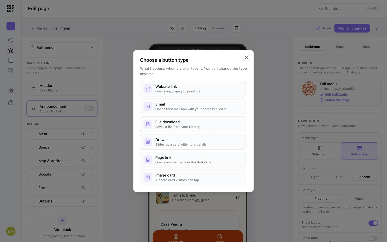
Buttons is the workhorse block. Adding one first asks what a tap should do:
| Type | What a tap does |
|---|---|
| Website link | Opens any URL |
| Opens the mail app with your address filled in | |
| File download | Saves a file from your Library, such as a PDF |
| Drawer | Slides up a card with more details, without leaving the page |
| Page link | Opens another page of the same KuikPage |
| Image card | A photo or icon card visitors can tap |
One block holds one type, up to twenty buttons; mixing types means two blocks. The type can be changed later under Style, Button type and applies to every button in the block.
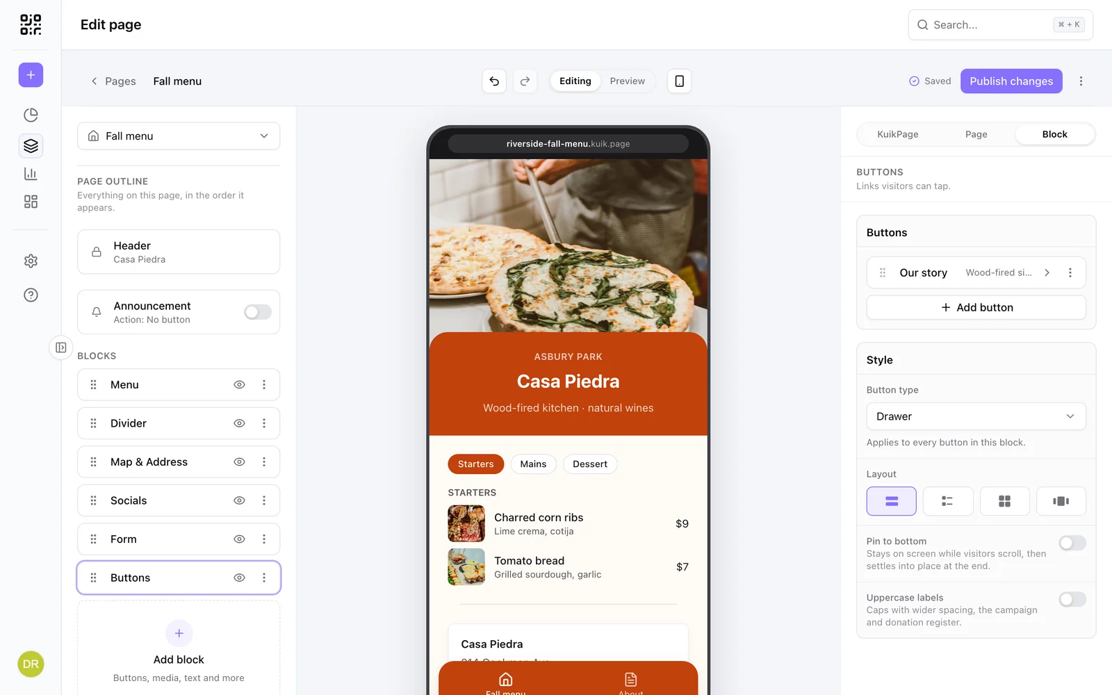
Style holds the block-level choices: Layout as List (full-width buttons), Rows (icon in an accent square, label, optional description and chevron), Grid (two or three columns), Carousel or, for photo cards, Banner (below); Pin to bottom, which keeps the buttons on screen while visitors scroll and lets them settle into place at the end; and Uppercase labels. Each button has a Label and a Style, Filled or Outline, plus the fields of its type.
Banners turn photo cards into wide promo cards with the headline and the button on the artwork, the "Order now" card of a campaign page. Each card is one banner, and the whole banner is the tap target. The choices apply to every banner in the block, so a stack reads as one set:
- Banner style: Photo (the words on the photo, darkened behind them so they stay readable), Split (a color panel beside the photo), Fade (the photo dissolves into the panel), Panel (a cut-out image, such as a product shot with a transparent background, standing on the color), Inset (a light card set inside a colored surround) or Framed (the photo set inside the color panel, with a margin all around and its own rounded corners).
- Text position: Left, Right, Top left, Bottom or Center on Photo; Left or Right on the panel styles, where the photo takes the other side.
- Alternate sides: with the words on the Left or Right, every other banner swaps sides, so a stack of banners zigzags down the page.
- Text width: Auto sizes the column for the longest headline in the set, so every banner shares one split and the photos line up. A long headline gets a wider column (and slightly smaller type) instead of cramming it. Narrow and Wide fix it.
- Headline size (S to XL) and Headline color (Auto, Accent or Custom). Uppercase labels sets the headline in caps too. When an Accent or Custom headline would be hard to read, a warning says so: measured exactly against a panel, and estimated on a photo from the part of the photo the words sit on.
- Button: Label, Arrow (an arrow-only button), Outline, Cut corners (an outline with the top-left and bottom-right corners cut), Glass (a frosted pill) or None (a chevron; the banner is still the link).
- Swipe puts the banners side by side in a row visitors swipe, the next one peeking in, instead of stacking them.
- Height: Short, Standard or Tall.
- Panel color (Accent, Dark, Light or Custom) and a Pattern printed on it (Halftone, Stripes or Dots), for the panel styles.
Per banner: the Photo, its Photo focus (Left, Center or Right, so the crop keeps the subject), an optional Logo in the top-left corner, the Headline, an optional Description, the Button label, and what it Opens: a Website (its link), another Page of the KuikPage, or a Drawer that slides up with its own title, text, image and link, the same as a Drawer button.
Drawers
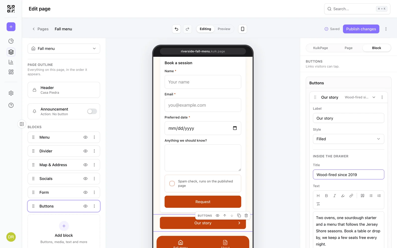
A drawer button carries its own content, edited Inside the drawer: a Title, rich Text with headings, bold, links and lists, an optional Image and an optional link out. It is the place for detail that does not deserve a page of its own, such as ingredients, opening hours, a story, terms of an offer.
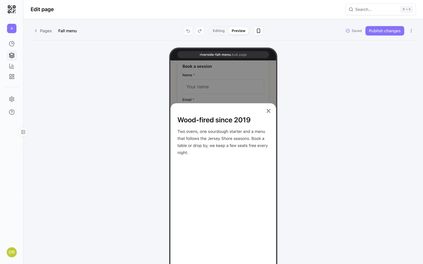
In Preview, and on the published page, tapping the button slides the card up over the page; the close button or a swipe dismisses it.
Media
| Block | What it does | Options |
|---|---|---|
| Image | A photo from your library | Alt text, caption, tilt; Remove background cuts a product or person out of the photo; Full width runs it edge to edge and Fade dissolves its top or bottom into the page, a landscape rising under a closing line |
| Gallery | Photo grid, carousel, spotlight or fan | Up to 12 photos; carousel ratio, one or two per view, dots or arrows, captions. Spotlight shows the first three photos in a row with the first one framed and raised in the middle; Fan tilts the two beside it like prints in a hand; both take a shape and Titles on photos, set in the title font |
| Before & After | Two photos under a slider | Photo shape (photo, square, portrait, wide), horizontal or vertical, labels, starting position |
| Video | Upload or YouTube and Vimeo | Privacy-friendly embeds; a spinner shows until the player is ready |
| Audio | An MP3 visitors can play | Title, artist, artwork; player card or compact row |
| Music link | One song, every platform | Paste one link, get Spotify, Apple Music, YouTube, SoundCloud, Amazon Music, Deezer, Tidal and Bandcamp buttons. PRO |
| File download | A PDF from your library | Name, details line, button label; card or button |
| Embed | Forms and scheduling tools | Google Forms, Typeform, Tally, Jotform, Calendly and Cal.com, from the tool's share link; four heights (Small, Standard, Tall, Full); a spinner shows until the tool appears |
Actions
| Block | What it does | Options |
|---|---|---|
| Form | Collect names, emails and more | See Forms. PRO |
| Guest uploads | Visitors add their photos to a shared gallery | See Guest uploads. Core |
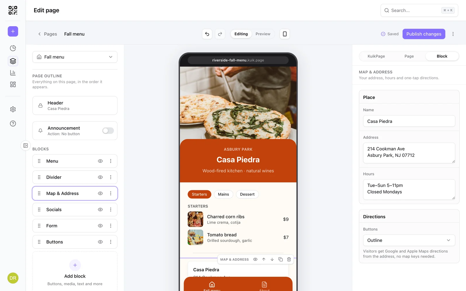
| Map & Address | Address, hours and directions | Google and Apple direction buttons |
| Open hours | Your week of hours with a live Open now or Closed | List, Week or Status layout; per day open or closed with a second range for a lunch break; Monday to Friday in one row or each day on its own; time zone; a note for holidays |
| Add to calendar | Google and Apple calendar links | Name, start, end, location, details |
| Events | Upcoming dates in order, like tour dates, classes or markets | Per event: name, date (or TBA), time, last day for a run of days, place, a link the whole row opens and a short badge such as Sold out. Rows before Show all, past events folded into a list or taken off, a calendar button per row, a title that folds the list away, and a button under the list |
| Countdown | Counts down to a date, live | Title, target date in each visitor's time zone, text when it hits zero |
| Coupon | Promo code on a ticket | Offer headline (a leading number becomes the big figure), monospaced code with a Copy button, terms; hide the code until tapped or show it at once |
| Menu | Sections, items and prices | Import from a CSV; photos, descriptions and cook times per item |
| Products | Image, name and price cards | Card or overlay layout, one or two columns, variant chips, link or lightbox. A product with Details opens a sheet instead: its photo, options, price, the text and a Sheet button to its link, in its own Sheet color when you set one |
| App badges | App Store and Google Play buttons | Dark or light badges |
| Review funnel | Route four and five stars to reviews | Public review link, private feedback email for lower scores. PRO |
Events keep themselves current. The published page checks the dates on each visit, so an event moves to Past events (or off the page, if past events are off) the day after it ends, with no republish. Visitors on Android get a Google Calendar link from the calendar button; everyone else gets a calendar file.
About Embed
Paste the share link of a supported tool and the block renders it inside the page in a sandboxed frame: Google Forms, Typeform, Tally and Jotform for forms, Calendly and Cal.com for bookings. Pick Compact, Standard or Tall to fit the tool. Only these vendors are accepted, because each one is known to allow embedding safely; HubSpot forms and meetings, Eventbrite and Luma are not on the list yet. For appointments, an Embed with a Calendly or Cal.com link is the block to use; Add to calendar is for a fixed event visitors save to their own calendar.
About Menu
A restaurant menu can be typed in or imported. Template downloads a CSV with one row per item (section, name, description, price); Upload CSV builds the whole menu at once. Each item can carry a photo, a longer description and a cook time, and each section becomes a tab at the top of the block.
Plans
Basic includes the link-in-bio blocks: Header, Buttons, Socials, Rich text, Heading, Image, Divider, Marquee, Stack and Map & Address. Core adds every other block (Form, Gallery, Video, Audio, Quote, Testimonial, Timeline, Before & After, Chart, App badges, Products, Details, Checklist, Menu, Open hours, FAQs, Countdown, Coupon, File download, Add to calendar, Embed) and the announcement bar. PRO adds Guest uploads (with the plan's storage allowance), Music link and Review funnel, and lets a Form send its submissions to a webhook. Gated blocks show a dot in the palette and explain the plan when clicked. After a downgrade, blocks already on a page keep saving; to publish, remove the ones the plan no longer includes.